2025
Digital Publishing
Product Design
Background
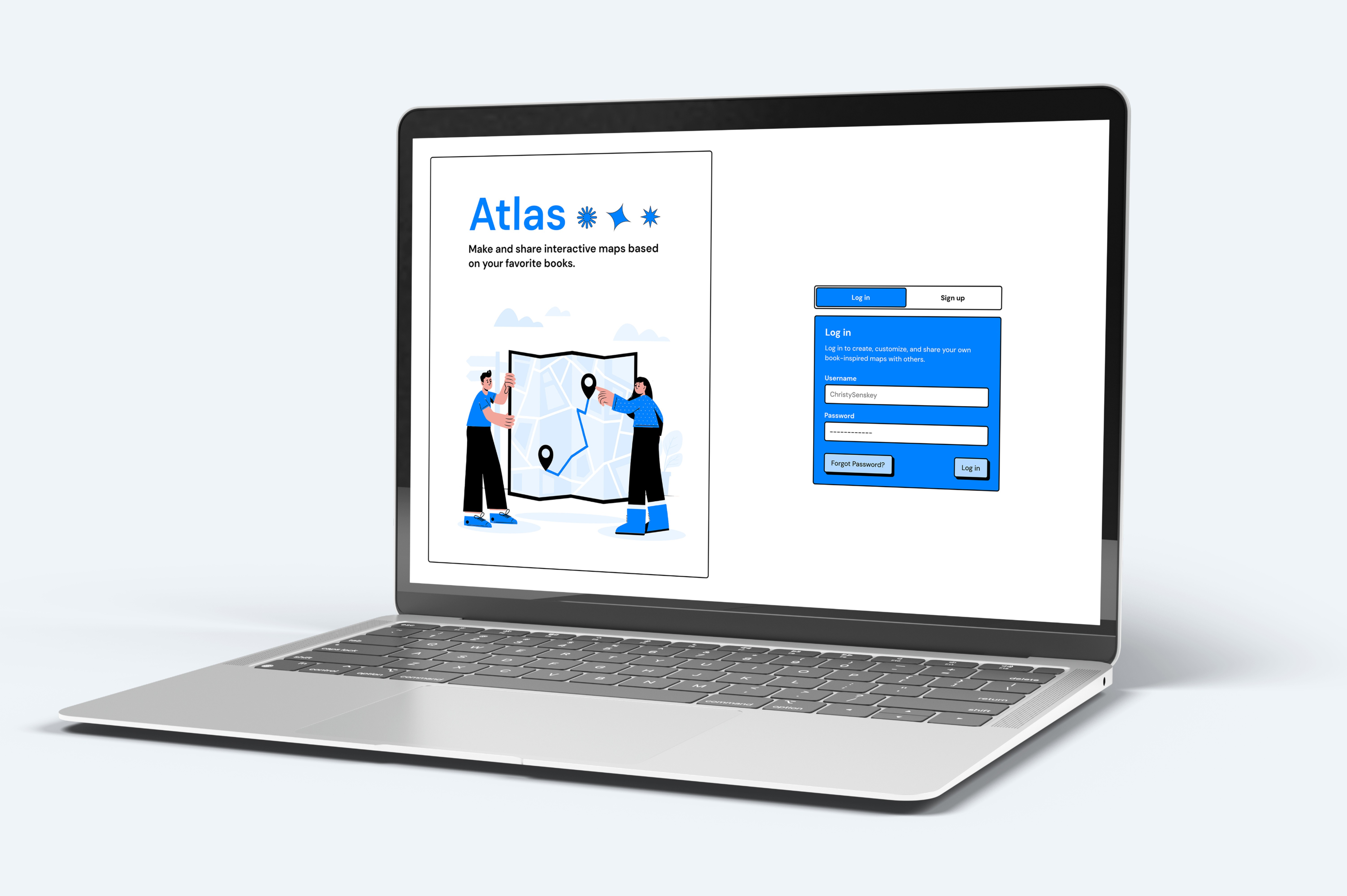
Atlas is a web application for creating and sharing interactive maps based on books. Readers can visualize narratives through location, mark key events, and explore maps created by others. The project examines how literary experiences can become spatial and interactive within a structured design system.
Core problem
Readers engage deeply with story worlds, yet there are limited tools for visually mapping narratives in a collaborative way. The challenge was designing an intuitive, immersive platform while working within an established neutralist framework that initially introduced visual density and unclear interaction cues.

User Stories as Structure
Atlas supports both creators building detailed book maps and explorers browsing community content. Features were defined through user stories centered on creating, customizing, sharing, and discovering maps, which directly informed the wireframes and overall structure of the platform.

Process
Wireframes were developed directly from user stories before visual styling was introduced. Two rounds of user testing — after initial styling and at project completion — revealed that heavy visual containment made the interface feel cluttered, with large components often mistaken for buttons. These insights guided refinements in hierarchy, spacing, and interaction clarity.

Adapting the Design System
Atlas was built using a neutralist open-source design kit. While the structural framework remained intact, color, typography, and select components were adjusted or removed to better support usability. Rather than rejecting the system, the design evolved through selective adaptation to reduce visual noise while maintaining its identity.

Interaction & Hover States
As a desktop-first experience, hover states became central to usability. Testing revealed that clearer interaction feedback was necessary, leading to refined hover states and subtle drop shadows that create the illusion of pressable elements. These adjustments strengthened hierarchy, reduced confusion, and made the interface feel responsive without adding visual weight.

Home & Navigation
The home screen functions as a central hub where users can access personal maps, drafts, liked content, and community creations. A persistent side navigation maintains structure across sections, while selecting “create” transitions the user into a full-screen workspace for a more focused experience.
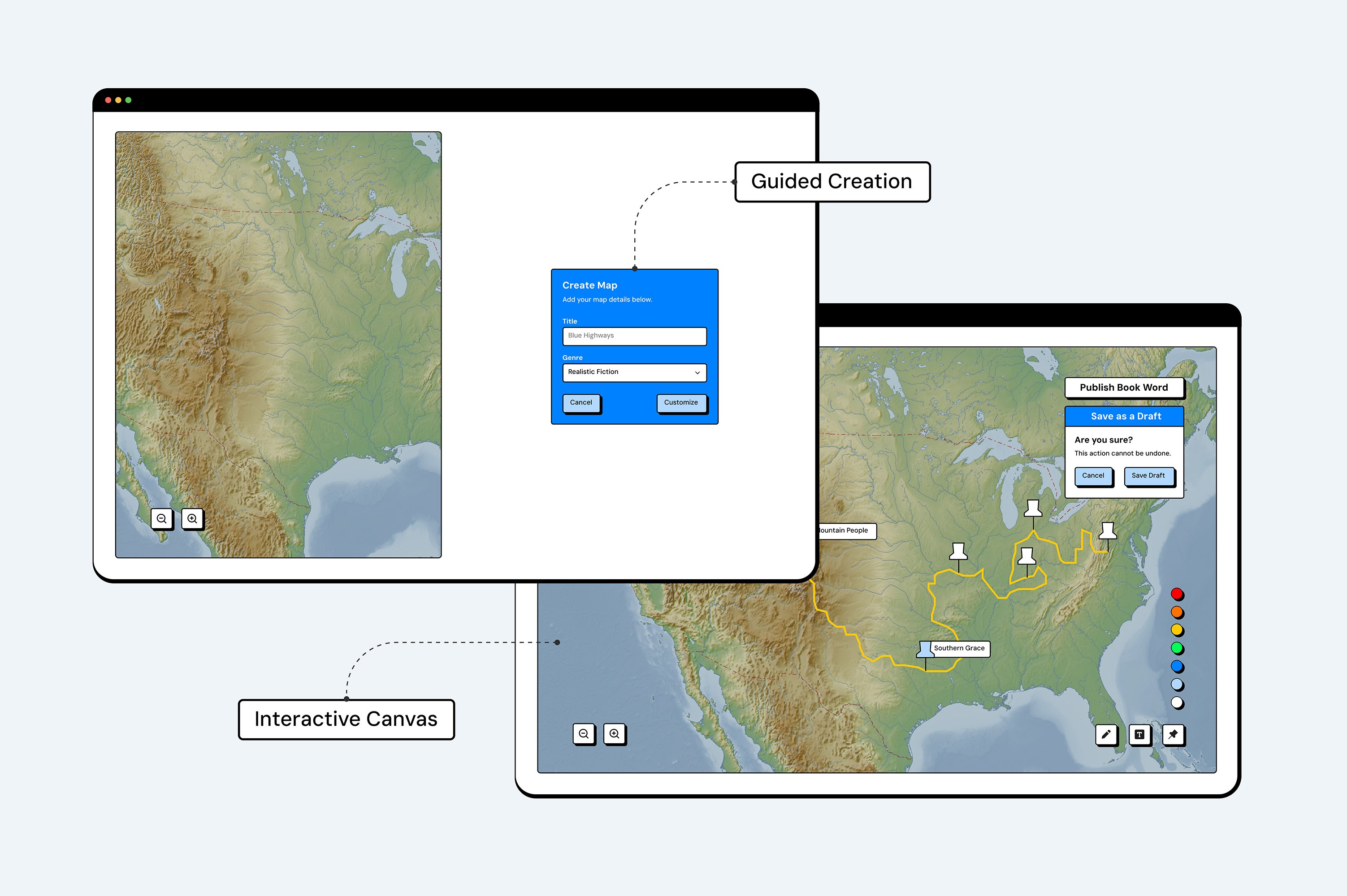
Map Creation
The full-screen creation view supports detailed customization. Users upload an image or select a location, add book information, and enhance the map with pins, comments, lines, and color-coded shapes to visually represent narrative events and relationships.
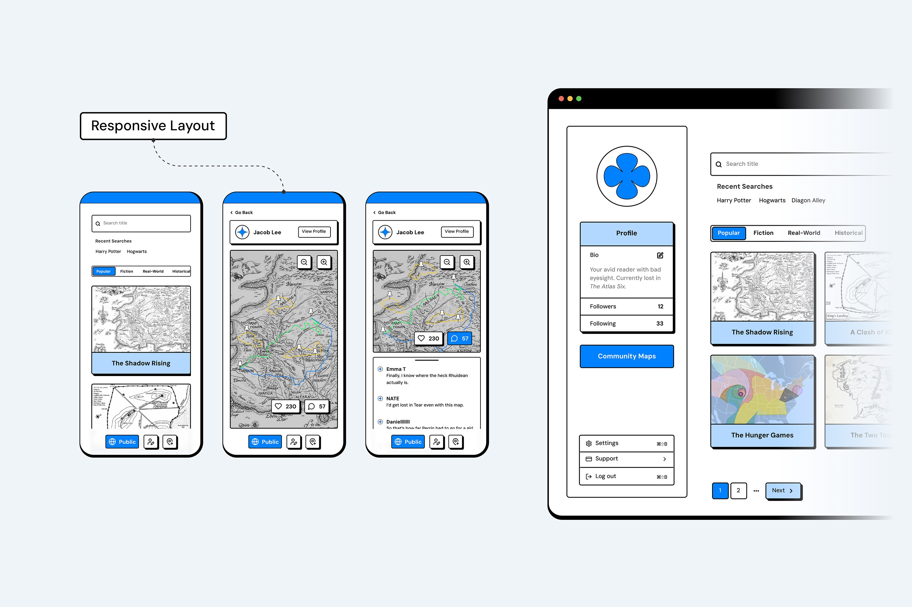
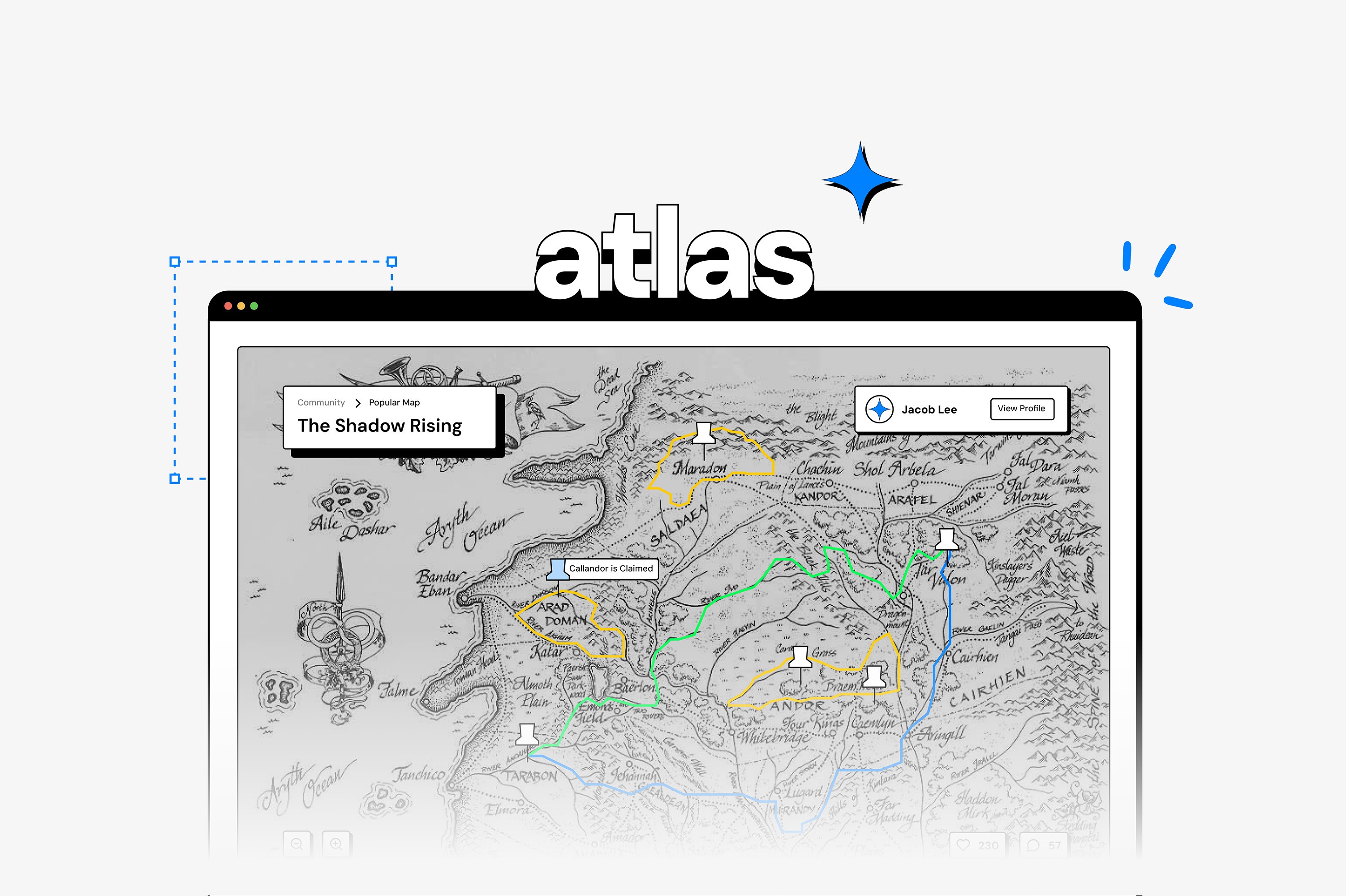
Community & Profiles
Users can browse maps by genre or search for specific titles. Selecting a map reveals comments, likes, and the creator’s profile, which mirrors the user layout for consistency while allowing exploration of related work. The interface was also scaled to iPhone, adapting into a vertical layout while maintaining structural clarity and system consistency.
Reflection
Atlas reinforced that constraints strengthen design decisions. By thoughtfully adapting an existing system rather than rebuilding it, clarity emerged through hierarchy, interaction design, and iterative refinement.