2025
Smart Home
Product & Systems Design
Background
Nurtura rethinks lawn care as a connected system rather than a collection of tools. By linking soil sensors, weather inputs, and irrigation controls, it adapts automatically while keeping homeowners informed when it matters. This project focuses on reducing guesswork through intentional structure and quiet, supportive automation.
Core problem
Homeowners are busy, and most don’t have the expertise to keep their lawns consistently healthy. At the same time, the pressure to win “yard of the month” — or at least keep up with the neighbors — is real.
A lush green lawn sounds simple, but it takes understanding soil conditions, adjusting for seasonal changes, and avoiding overwatering — things most people don’t have time to figure out. Without clear feedback or tools that work together, lawn care becomes trial and error — or an expensive fix that still misses what’s happening below the surface.

Research Insights
After reviewing Reddit forums, speaking with homeowners, and comparing existing products, a clear pattern emerged: smart lawn tools still require too much interpretation.
Pain points
Soil moisture data without context for what’s healthy
Frequent manual schedule changes as weather shifts
Uncertainty about whether the system is working
Learning curve for tools that don’t communicate
User goals
Confidence their lawn is being handled
Fewer week-to-week decisions
Clear feedback only when action is needed
Framing the Opportunity
The opportunity wasn’t to add more data — it was to connect the right systems so they work quietly in the background. A smart sprinkler, soil sensor, and mobile app shouldn’t feel like separate tools. They should function as one.

Defining the Structure
The design process prioritized structure before visual polish. Each screen was intentionally focused on one clear signal, removing data that didn’t directly support a decision — especially given the needs of the persona.

Building the Interface
The design process prioritized structure and ease of use. Each screen was designed to be purposeful — showing only what was necessary in that moment.
Given the persona, the goal wasn’t to surface more data, but to reduce it. Information that didn’t support a clear decision was intentionally kept out of primary views.

Entering the System
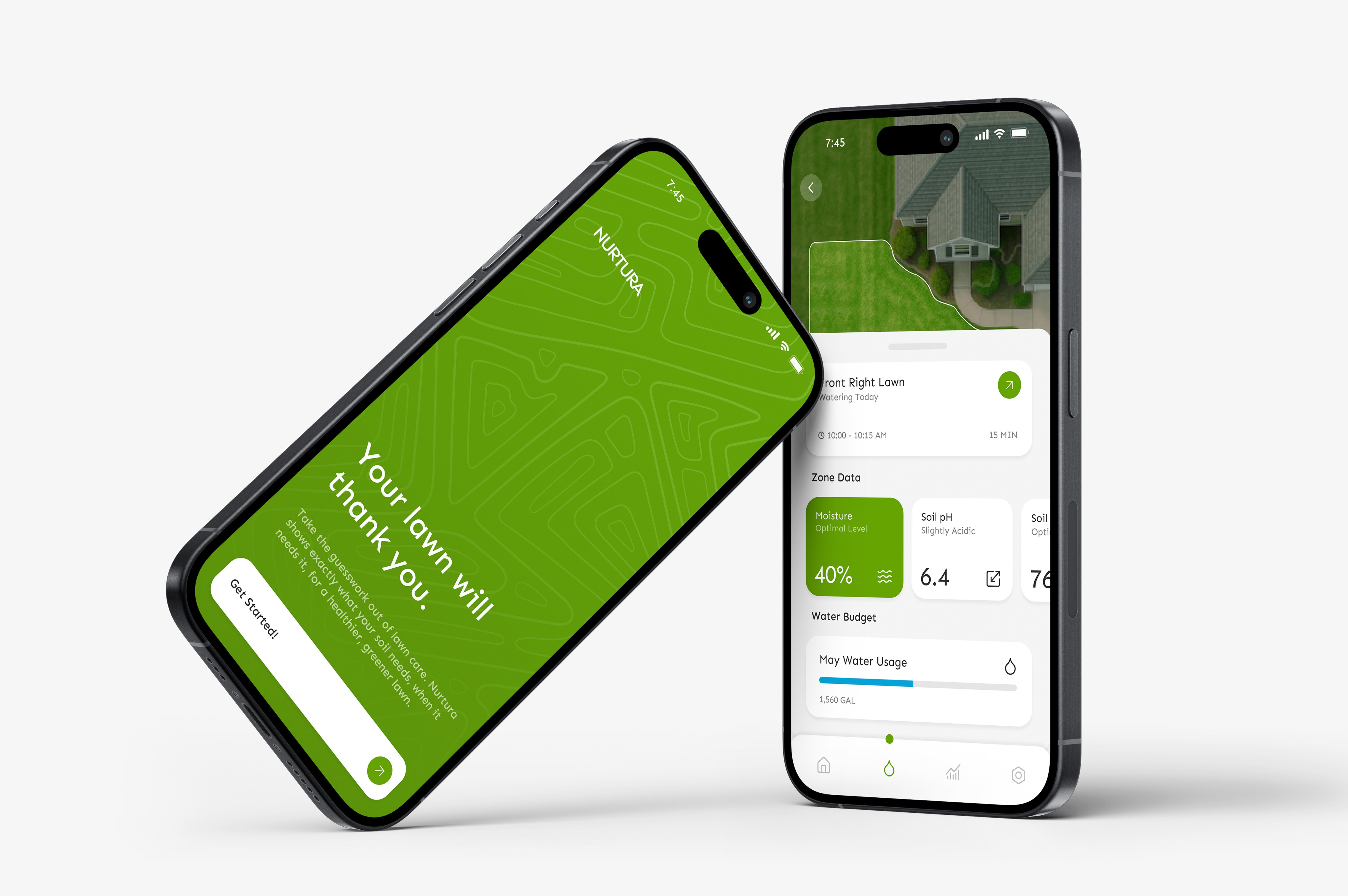
Getting started needed to feel straightforward. Because the system relies on real-world inputs, onboarding focuses on setting location, pairing devices, and defining zones clearly from the start. The goal was to make setup feel simple while quietly establishing the foundation the system needs to adapt over time.

Everyday Use
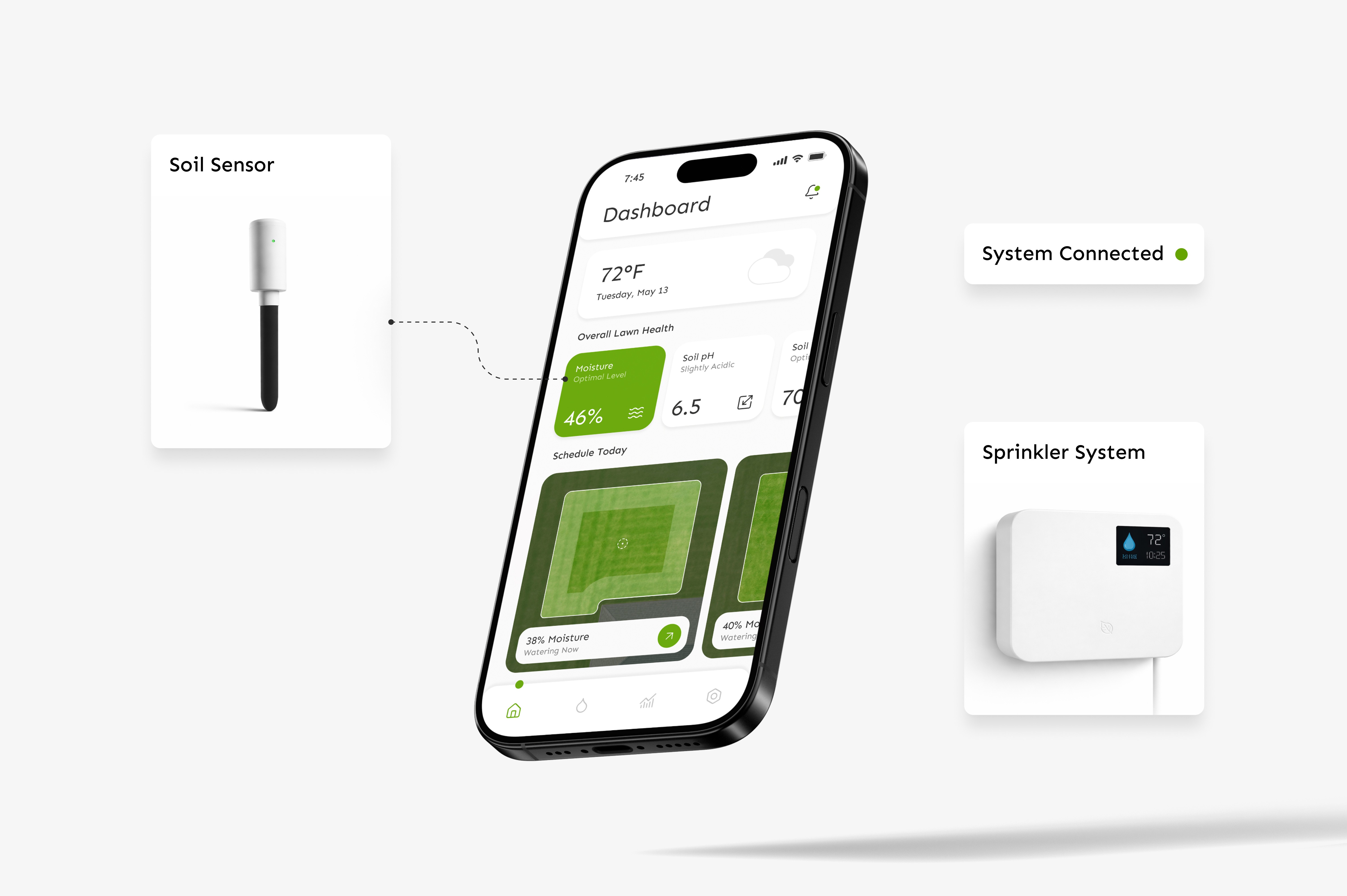
The daily interaction centers on checking soil health, understanding why the system is watering, and adjusting when necessary. From the home screen, users can tap directly into a zone to see moisture levels, watering schedules, and usage details — with controls just one step away. Most actions stem from this main view, which is why it’s surfaced immediately. No digging required.

Designing for Edge Conditions
A connected system isn’t defined by the ideal scenario — it’s defined by how it responds when conditions shift.
Location setup grounds the system in real environmental data from the start. Alert states surface weather and system risks before they escalate. Active states make it clear when and why watering is happening. Insight screens provide transparency into usage and long-term performance.

Reflection
The home screen was the hardest part to get right. Balancing visual appeal with true necessity took multiple iterations — especially deciding what not to show.
Working within a widget-based system made the experience feel structured and credible, but it also introduced new constraints. Leaning on the persona helped clarify decisions, particularly around onboarding and how the system should function as one connected experience.